Showing posts with label City in Flux. Show all posts

Saturday, 22 November 2014

Consume Collage

I experimented with using cutouts of letters from popular brands to form a 'ransom letter' styled aesthetic with the aim of conveying how, as a society, we are held to ransom by the culture of acquiring and consumption of goods.

I started out by arranging a selection of cutouts from popular brands to form 'consume'. Overall, I thought the work was bland, so I developed it further.

Because I thought the original background was somewhat boring, I added a pile of receipts to form a backdrop.

Developing this idea further, I thought the background was too distracting from the main message that I was trying to communicate; adding a gaussian blur to the receipts enabled me to solve this problem. 

I experimented with various blending modes with the cutouts, although this was difficult because I still had to sustain the identities of the brands used in the cutouts. 

Thursday, 6 November 2014

City in Flux Research - ISSUU

http://issuu.com/jackbarnes94/docs/research_indesign?e=14270642/10033171

Wednesday, 5 November 2014

Visual Experimentation - Coca Cola


This is another example of some visual experimentation I have performed to illustrate the themes of consumerism that I am exploring in my response to the brief. I think the idea of this 'explosion' of coca cola logos highlights the philosophy of marketing that coca cola is renowned for. 

Visual Experimentation

As part of my research into consumerism and marketing, I collected examples of marketing and advertising to illustrate how we are always surrounded by companies trying to sell things to us. I made a selection of materials that were predominantly red. I then experimented with composition on photoshop to make sure all the information I wanted to communicate was visible and then I experimented with the blending modes and the opacitys of various layers.

Overall I was extremely satisfied with the outcome of this experimentation. I think the lowered opacity of the coca cola logo helps to show how we are sometimes oblivious to marketing / advertising that surrounds us on a daily basis. 

Nightscapes: Jakob Wagner

I found some photography on Behance by Jakob Wagner showing a number of cities at night.


My favourite aspect of this image is the combination of the blue and red lights from the traffic and the red and blue signs on the buildings.


I like the use of long exposure in this image to illustrate the volume of traffic that's constantly travelling through Shanghai - capturing the scene of a city in flux.  

I feel that the use of the puddle to reflect the skyline in this image is really creative. In addition to this, I like the juxtaposition of the derelict outskirts of the city and the massive Shanghai skyline. 

Again, the use of long exposure photography here illustrates energy and movement that occurs in a city. I also like how the lights from both sets of traffic symbolises how they're all going in opposing directions. 


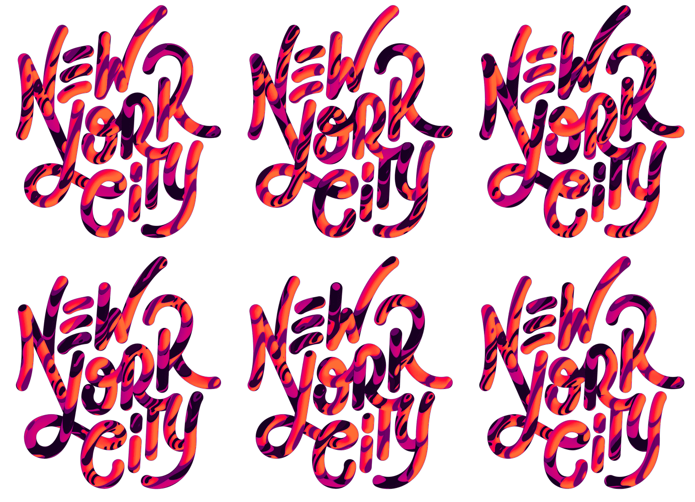
Metro AR-T: New York City - David McLeod


This was a motion-based piece of typography for an augmented reality app by David McLeod. I really like how the motion graphics creates this sense of energy that New York is renowned for. 

I think I could use this approach in a response to the brief, although I could tweak it by having a time lapse of a specific city to represent the typography which would really emphasise the idea of a city being in flux. 

Source

Adidas City Series: Marcus Reed

The adidas city series was a personal project set by Marcus Reed in which he incorporates the vintage adidas striped iconography into a series of illustrations which represents a number of European cities.


Overall, I really like how the colours that are used can be linked to both the city's and adidas' identity. In addition to this, I like how by just using the lines that creates adidas' identity, the artist also creates these easy-to-identify illustrations of famous landmarks. 

I think expanding on this idea, and combining it with the style of illustrations used for road signs, I could create illustrations of city landmarks. 


Margaret Calvert on Top Gear


During my research into Margaret Calvert and Jock Kinneir's road signs, I came across a segment of Top Gear in which she is interviewed by James May.

I feel that this segment helps to bring the importance of functional design to the masses.