Thursday, 11 December 2014

Adobe InDesign Tutorial


Today I had a tutorial in Adobe InDesign. We had to create a newsletter and covered various element of Adobe InDesign. Because I have used InDesign in the past, I knew most of the things we covered. Despite this, I did learn some things.

I learnt about the use of master pages which applies things such as text and shapes to all pages within the document. I found that this would make my workflow more efficient.


I also learnt about text wrapping in InDesign which helps to arrange text around image. I feel this will come in useful when laying out my work for magazine in my Citys in Flux brief. 

Saturday, 22 November 2014

Consume Collage

I experimented with using cutouts of letters from popular brands to form a 'ransom letter' styled aesthetic with the aim of conveying how, as a society, we are held to ransom by the culture of acquiring and consumption of goods.

I started out by arranging a selection of cutouts from popular brands to form 'consume'. Overall, I thought the work was bland, so I developed it further.

Because I thought the original background was somewhat boring, I added a pile of receipts to form a backdrop.

Developing this idea further, I thought the background was too distracting from the main message that I was trying to communicate; adding a gaussian blur to the receipts enabled me to solve this problem. 

I experimented with various blending modes with the cutouts, although this was difficult because I still had to sustain the identities of the brands used in the cutouts. 

Thursday, 20 November 2014


I created two moodboards to represent my story using adobe indesign- 1 in the form of a clean moodboard in a grid structure and the other in a messy layout.

Friday, 14 November 2014

Kinfolk - Adobe InDesign Workshop Week

This was the result of today's Adobe InDesign workshop with Jeffrey Bowman.
Overall I was really happy with the outcome of the brief - the brief stated that the spread had to be engaging, display the images in an interesting way and to have beautifully set typography, leading me to believe I satisfied the brief.

2 aspects of the spread which I was really pleased with were the front cover, because I believe the text and image go really well together, and the 3rd page because of how I experimented with the framing of an image. 

Despite this, however, I initially forgot to caption the images, leading me to add them on later, which I found hard because I planned the layout without taking into account that the images had to be captioned. I think the way I implemented the captions could be improved. 

Sunday, 9 November 2014

Physical Workshop Story

Process and Production - Story

A strange man stood in the doorway. I had never seen him before in my life. The last time something like this happened before, I never saw my brothers and sisters again. Somewhat reluctantly, my owner left me for a split second. I felt the anxiety rush through my body. I quick lunge and I was gone. I was overpowered, despite my best efforts, leaving a trail of noise in my wake.


Thrown into a car, I watched as my home faded from view. Would I ever see my family again?


Time passed slowly, as dusk crept in. The soft hum of the engine soothed me, giving me the slightest slice of comfort, sending me to sleep.


Seagulls. I hated the things. I used to love chasing them. The reminder of home saddened me. It was even worse that I couldn’t see the. Where was I? I was trapped in a cage, wrapped in a thick tartan blanket. Maybe I was going home? I felt the car slowly nudging forward in conjunction with the sound of horns, shouting and the mechanical furore of heavy machinery. The engine clicked off and a door slammed. I was alone. Scared. I heard talking outside. The car boot opened and the blanket was pulled from the cage, unveiling a thuggish bald man. Everything about him was intimidating. He was approaching me with a briefcase. Placing the briefcase on the ground, he unveiled his phone from his pocket and was pointing it at me, accompanied with faint clicking sounds. When he was done, the blanket was thrown over me again and I was hoisted into another vehicle.


We arrived at what I assumed was the man’s home. It wasn’t very pleasant, especially compared to my old home. It was grotty and bare. I didn’t really know how anyone could call this a home. I was left in a damp kitchen, as the man exited the room and went upstairs.


It was beginning to be morning and sunshine was beginning to pierce the rags that appeared to be curtains. I had been left alone all night and I was growing hungry. The man clambered downstairs, taking a brief look at me before making a phone call. Whilst he was on the phone, however, an array of flashing blue lights lit up the house from the outside. Visibly panicked, he rushed to the window, shut the curtains smashed his phone, and ran for the door. Before he reached the doors, 3 uniformed men barged through, knocking the man off his feet and onto the floor. Somewhat startled, I was approached by the 3 men, picked up and placed into the car with flashing blue lights. Surely this wasn’t happening again?

We drove for a while before stopping and that’s when it hit me. I was home at last. The door opened and she was waiting for me in the garden, crying. Overcome with joy, I dived straight into her arms. It was so good to be home. I didn’t really understand what had happened, but I didn’t really care. All I know is that being a rare lilac bulldog gets a lot of people interested in you.

In this exercise we had to create a trailer using images and sounds. In this instance, I used some photography from my hometown of Barnsley. As I studied media during my A-Levels, I felt somewhat comfortable using this editing software, despite using final cut in college. 

I began by importing the images onto the timeline and arranging them. Cropping was also involved at this stage. I didn't want the shots to be too long because it would be boring, but having them being too quick could be too hectic for a viewer. I also had to cut the audio to get rid of the parts of the track that I didn't like.

Keyframing was also involved during the process of creating the trailer. Again I was familiar with how keyframing works as a general rule, and in this instance I adjusted the opacity of the shots which, in combination with having another layer below the current shot on the timeline, allowed me to create cross dissolves. I also keyframed a gradual increase on the scale to create a slow, zooming effect, which I felt made the shots look less boring than having stationary shots. 
Overall, to say this was the first time I used after effects, I felt that the outcome was successful. Despite this, I felt my lack of experience with the software restricted me from being too creative with the trailer.


Thursday, 6 November 2014

City in Flux Research - ISSUU

http://issuu.com/jackbarnes94/docs/research_indesign?e=14270642/10033171

Wednesday, 5 November 2014

Visual Experimentation - Coca Cola


This is another example of some visual experimentation I have performed to illustrate the themes of consumerism that I am exploring in my response to the brief. I think the idea of this 'explosion' of coca cola logos highlights the philosophy of marketing that coca cola is renowned for. 

Visual Experimentation

As part of my research into consumerism and marketing, I collected examples of marketing and advertising to illustrate how we are always surrounded by companies trying to sell things to us. I made a selection of materials that were predominantly red. I then experimented with composition on photoshop to make sure all the information I wanted to communicate was visible and then I experimented with the blending modes and the opacitys of various layers.

Overall I was extremely satisfied with the outcome of this experimentation. I think the lowered opacity of the coca cola logo helps to show how we are sometimes oblivious to marketing / advertising that surrounds us on a daily basis. 

Nightscapes: Jakob Wagner

I found some photography on Behance by Jakob Wagner showing a number of cities at night.


My favourite aspect of this image is the combination of the blue and red lights from the traffic and the red and blue signs on the buildings.


I like the use of long exposure in this image to illustrate the volume of traffic that's constantly travelling through Shanghai - capturing the scene of a city in flux.  

I feel that the use of the puddle to reflect the skyline in this image is really creative. In addition to this, I like the juxtaposition of the derelict outskirts of the city and the massive Shanghai skyline. 

Again, the use of long exposure photography here illustrates energy and movement that occurs in a city. I also like how the lights from both sets of traffic symbolises how they're all going in opposing directions. 


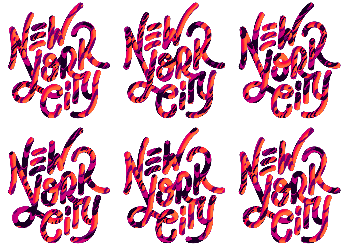
Metro AR-T: New York City - David McLeod


This was a motion-based piece of typography for an augmented reality app by David McLeod. I really like how the motion graphics creates this sense of energy that New York is renowned for. 

I think I could use this approach in a response to the brief, although I could tweak it by having a time lapse of a specific city to represent the typography which would really emphasise the idea of a city being in flux. 

Source

Adidas City Series: Marcus Reed

The adidas city series was a personal project set by Marcus Reed in which he incorporates the vintage adidas striped iconography into a series of illustrations which represents a number of European cities.


Overall, I really like how the colours that are used can be linked to both the city's and adidas' identity. In addition to this, I like how by just using the lines that creates adidas' identity, the artist also creates these easy-to-identify illustrations of famous landmarks. 

I think expanding on this idea, and combining it with the style of illustrations used for road signs, I could create illustrations of city landmarks. 


Margaret Calvert on Top Gear


During my research into Margaret Calvert and Jock Kinneir's road signs, I came across a segment of Top Gear in which she is interviewed by James May.

I feel that this segment helps to bring the importance of functional design to the masses. 

Thursday, 30 October 2014

Lightbulb Tutorial

This was the outcome of the tutorial. Overall, I think the process was successful, as I feel becoming familiar with the patch tool can really help me out in the future. The patch tool is content-aware, meaning that it is really useful is seamlessly arranging your work in order to sustain continuity. I found the tool extremely flexible and easy to get to grips with.

I think if I could improve one aspect of the overall outcome, it would be to improve the reflections of the tree. I think the lighting doesn't work too well. To improve it, I could have spent more time outside of university on refining the reflections, as well as studying how the reflections would have been formed. 

Thursday, 9 October 2014

ManvsMachine Film4 Rebrand

 I really appreciate ManvsMachine's rebrand for Film4. In particular, I like how the promos make references to popular films and how the Film4 logo interacts with the film's environment, creating this vintage film strip aesthetic.